a shady trick for designing distinct video game characters
When I was playing Red Dead Redemption 2 the other night, I realized that I was having trouble recognizing the characters. Now, I don’t mean that the art wasn’t good – RDR2 is beautiful, with detailed character animations and cinematic landscapes.
But somehow, I’d forget what the character who sent me on a mission, or the outlaw I was hunting, looked like. I would rely mostly on the markers in the mini map and other in-game cues like who I could interact with to complete my missions.
This got me thinking about what makes iconic video game characters like Mario or Sonic instantly recognizable. Granted, these characters look very different from those in AAA titles today, and they’ve been around for much longer. But, I came to one interesting insight that we can use as we try to make our characters memorable. I learned it from Pokemon.
Technology provides important boundaries for creativity
In the late ’80s and early ’90s, games didn’t typically contain many distinct characters. Sonic the Hedgehog (1991) basically had Sonic and Doctor Eggman. Mega Man (1987) had its six Robot Master bosses. Super Mario Bros. (1985)’s multiplayer mode required Mario and Luigi to be told apart quickly and easily, but also only had a handful of minions and Bowser.
In 1996, Nintendo released Pokemon, having succeeded at the unprecedented task of creating 150 identifiable Pokemon characters. The game was about collecting different types of Pokemon, understanding their strengths and weaknesses, and training them by fighting with other Pokemon. So, it was important that all 150 types of Pokemon appeared unique, on an 8-bit handheld Game Boy.
The original Game Boy featured a 160px by 144px screen with a 2-bit color palette, which supported 4 shades of “grey” that were in fact olive green. Battling Pokemon would have been watching two shapes wiggling, and picking moves from a menu.
 |  |
This means that the shapes themselves needed to be distinct. Anyone who grew up with the Pokemon animated series will remember each episode breaking for commercials with “Who’s that Pokemon?”, a screen showing the silhouette of a Pokemon that viewers could try to identify. And for a Pokemon fan, this was an easy game, because the shapes were so obvious.

The technological limitations of the time made it necessary for each character to have a unique silhouette. In a strange way, the technological impediments forced “retro” video game characters for early consoles to look outlandish and therefore be memorable.
As technology has advanced, it has allowed game artists to depict characters in more detail. This has made video games more cinematic and realistic. At the same time, pulling away from simplicity makes things harder to remember. It is more difficult for a player to recall a face, which is composed of many shapes with subtle differences, than for them to remember one blurry shape that represented a Pokemon in low fidelity.
When designing characters, a good test is to cast them in shadow and make sure their silhouettes are recognizable.
Here are our old favourites, which are instantly identifiable:
 |  |
 |  |
This technique is not limited to extremely cartoon-style characters.
 |  |
 |  |
One use is to identify characters as part of a game franchise. Even though it’s difficult to tell the difference between individual assassins, one look at any of these silhouettes and you can say with confidence that it’s a character from an Assassin’s Creed game.
More importantly, as seen in the Pokemon games, this technique can be used to distinguish between characters in the same video game.
An example is Dragon Age II, which has intricate interactions with the player’s NPC companions in its gameplay. I think they do a decent job on making the characters visually distinctive, with the help of some weapons and accessories.
Overwatch also does a good job at making its characters unique, down to their silhouettes. The cartoon/comic book style of the game’s art makes this exercise a little easier. I especially like how the characters vary drastically in height and size.
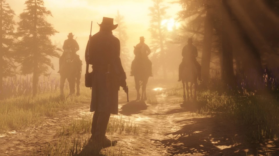
Finally, for kicks, here are shadows from some character artwork from Red Dead Redemption 2. Note that these images don’t show stature and posture, but they’re still remarkably similar.


